- The man that was killed by the subway had been trying to calm down a panhandler that had been harassing passenger when he was pushed by the panhandler. The man fell onto the tracks and was unable to pull himself back out. The photographer was there at the time and took the photo.
- The photographer says he took the photo as a way to use his flash to warn the oncoming train.
- I do think the photographer had a right to take the photo he did, especially after he knew he was unable to help.
- I do not believe that the photographer did his absolute best to help the man because it says that "after being unable to help [the man] himself" that was when the photographer took the photo. But there is no specification as to what the photographer did to help the man. He could have called to someone to help them, taken that photo, or had taken his photo real quick and continued trying to help the man.
- I agree with the decision to run the photo on the front page of the New York Post because it is news that happened and it's the media's job to share this news and tell the truth. It seems heartless, especially to the family of them man who now see that no one helped save his life, but it's all about sharing what happened to the public, giving them the details and maybe to help stop similar situations from happening in the future.
- It seems cold, but a photojournalist's job is to capture the images of life and that is what needs to be their main focus. A photojournalist must not get involved with their image, for they will get sucked in and possibly end up just like Kevin Carter. Photojournalists are just present to capture what is happening and then they must move on.
- I do not think it is ethically acceptable for a photographer to involve themselves into the situation they capture, for they are suppose to be a fly on the wall. If the photographer involves themselves in the image, then they are not capturing the true truth because they have no altered it once they involve themselves.
- Photojournalists should always try to avoid influencing events as they happen because they are just present to capture the situation to later share with the public. If photojournalist try to influence or involve themselves they could put their lives at risk, and it should be more like they don't exist at all.
- I think the most appropriate response that could be given would be one that talks about the quality of the image, rather then what is going on in the image. It's so cold and heartless, but as a photographer's job there needs to be a focus on the lighting of the image, the emotions that the image give you and the quality present. Photographers have to to disconnect themselves from the situation they capture because then they will never be able to use their photos or share then and would probably lose their jobs for not giving away their photos. It's tragic what happened to the man but to no fault of the photographer's. He needs to stay uninvolved to capture the image just as it is.
Monday, December 19, 2016
EXTRA CREDIT
Sunday, December 18, 2016
Final Review
1- Caption Rules: {Copied off Bowie Photojournalism Blog}
- First sentence includes major information about the photo (who, what, where, when, why, how).
- First sentence should be written in present tense as if the action of the photo is still happening
- Second sentence should be past tense, and should include background information.
- Information in caption should not be obvious by looking at the photo.
- If there are three or fewer recognizable people in the photo, you must give all of their names.
- Use strong action verbs whenever possible.
2- Rules of photography
- Rule of thirds- the idea of not having your subject centered in your photo but off to one side on the thirds of a grid.
- Balancing Elements- when there are more objects or subjects off to one side of the image, you can balance out the subjects by placing some on the other end of the image.
- Leading Lines- Lines in an image that lead and take you straight to a subject to pull you in and follow.
- Symmetry and Patterns (Repetition)- Symmetry is when the image is balanced out and identical to the other side. Repetition and patterns are quite similar for patterns are just elements that have been repeated.
- Viewpoint- Viewpoint includes many different perspectives in which an image can be taken.
- Background- An element or part that is behind your subject but still part of the image.
- Create depth- When taking your images you will have blurred out or small subjects that show that they are in the back and farther away, creating depth and a 3D feel.
- Framing- Using subjects in your image to border anther subject present.
- Cropping-To take a close photo of your subject as to get rid of unnecessary objects and "noise."
- Mergers and avoiding them- Mergers include sticking the same colors together or having an object sticking out of your subject. You have to avoid this so the image isn't confusing or weird.
3- Aperture, Shutter Speed and ISO
- Aperture- Is the size of the hole of your shutter. The larger the fstop, the smaller the hole. The smaller the hole, more things in the background will be in focus. If you want a blurry background you have to use a smaller fstop to get a larger hole.
- Shutter Speed- Is measured in seconds and fractions of a second. It is how fast the shutters open. Used to blur things, or to make them sharp and clear. Can also capture items in action, making them look as though stopped in time.
- ISO- The sensitivity to light the image will have.
4- Ethics of Manipulation
- Acceptable:
- Cropping
- Levels
- Not Acceptable:
- Altering colors
- Altering objects, peoples, animals, etc.
- Displaying false information as true.
5- Types of Portraits
- Environmental- A portrait taken in the subject's environment, and says something about them.
- Self- Taken by oneself. Can vary as to how they look.
- Casual- Not a professional headshot sort of image. Used to show something interesting about the person, can be creative.
- formal- are a bit more professional compared to informal.
- informal- are a bit more creative.
6- Photographic Terms
- Exposure- The amount of light taken in by the camera in a photo.
- Depth of field- Distance that is sharp enough to make the image have dimensions.
- Focal length- Distance between the lens and image sensor
7- Magazine Cover Types
- Early- Illustration based
- Poster- Includes title, caption and photo. Very simple and are rare and look like, well movie posters and such.
- Married to Type- Type is made to work with the photo, such as having it flow with the photograph.
- Forest of Words- Words! Words! Words! The type is more important than the photo in some cases. Words are all over the place and very important.
Wednesday, December 14, 2016


Tuesday, December 13, 2016
Deadlines in Journalism
- The term deadline has uncertain origins but early uses of it appear to have referred simply to lines that did not move.
- Missing todays deadline will impact me by making me behind on all of my other work that needs to be done.
- I have had a few issues meeting deadlines in my other classes, and some consequences for those late assignments was getting points off my initial grade.
- I was always able to meet deadlines in my class, up until recently for multiple personal reasons. There were a few times when I was unable to meet deadlines before mostly because I would forget that we had the assignment, well assigned.
- What specifically kept me from meeting today's deadline was the lack of time to work on the assignment.
- What I plan to do to complete this task as soon as possible so I may earn credit is to work on my assignment whenever I can. This includes work on blogs at home, and coming in during fit and/or lunch to work on assignment, either both or something else.
- In all honesty, all of the suggestions from the website are every efficient especially for a very inefficient person like me. But I do believe that not getting sidetracked is the most important. If I were to get sidetracked, I would end up not doing any work so it's important for me not to get distracted.
- I think budgeting my time is the toughest for me to complete because I've never been good with schedules and I just end up cramming work into short amount of times. And when taking breaks I say I'll give myself ten minutes which ends up being half and hour.
- I am a night person (but not for much, I rather sleep).
- Some difficulties to being a night person, is that when I go home from school my time is already limited, but I want to mess around and do other things instead of work because it's been what I've been doing all day at school already.
- I can create a dedicated study time by having someone, such as my parent, tell me to get to work, sit down and remove all distractions from my reach so I may work.
- Some things to do to get rid of distractions is to find a quiet, distraction-free area to study, remove (all) electronic devices, such as phone, from my reach possibly by giving it to my parent, and listening to music for me helps to make me forget about all the distractions around by having me focus.
- The correlation between controlling your homework and time management is that they go together because if you don't manage your time, set aside time to do your work, you'll never get it done and be unable to "control" your homework.
- My ideal study setting would probably be a library where it is unlikely for me to get too distracted, being somewhere warm and comfy is great so it doesn't bother me, and being able to listen to music that can block out the outside world is great. Being somewhere that isn't too far from food is good too because if I'm hungry I won't be able to work.
- The biggest distraction I have when studying is either the internet, where I'll just end up searching a whole bunch of stuff from my shows, or Netflix (or other show/movie streaming applications) because whenever I'm behind on my shows I wanna multitask and watch them while I work so I can have time to watch.
- Three things I could do to stop from being distract from these things is to give my parent my electronic device where I can access the internet and other streaming apps, I could also have the wi-fi turned off from my phone, and I could have a system where I give myself a little break from time to time so I'm less tempted to check my phone or internet while working.
Monday, December 12, 2016


Sunday, December 11, 2016
Top 100 Photos of All Time


"V-J Day in Times Square"
I picked this image because of how iconic it is. The sailor kissing a nurse in Times Square was taken by Alfred Eisenstaedt, who made it his "mission" to capture a storytelling moment. It's said that he didn't go far, for World War II ended and everyone celebrated in Times Square. As Eisenstaedt searched for his moment a sailor before him grabbed hold of a nurse, dipped her back and kissed her. Eisenstaedt's photo is still highly admired and forever lasting.
Also included in the article were photos of the LIFE magazine, covering the celebration of the end of the war from across the country. It shows how nationally important the end was and how the entire country celebrated.
Alfred Eisenstaedt attended Humboldt University of Berlin, was born December 6, 1989, in Tczew, Poland and died August 23, 1995.


"Invasion of Prague"
This image really caught my eye because to me it seems like the watch is telling us something. It seems as though the man with the watch is counting down the hours, minutes, seconds until this invasion takes place. Makes you wonder how much long will it be when this invasion takes place.
As tanks rolled into Czechoslovakia and quickly seized control of Prague, Josef Koudelka was in the present at the capital when soldiers arrived, and at the time had been a young Moravian-born engineer who took photos of Czech life. Koudelka's pictures had to be smuggled out of the country and later appeared in the London Sunday Times, under a pseudonym for Koudelka feared he would be punished for his photography.
Josef Koudelka attended Film and TV School of the Academy of Performing Arts in Prague. He was born January 10, 1938, in Boskovice, Czech Republic; Koudelka lived to the age of 78.
An extra image shared on the article was of multiple images Koudelka took turning the Russian Ivnasion of Czechoslovakia. I learned that it takes more than one shot to take the right image that you want.


"Windblown Jackie"
I choose this picture for the simplicity of it and how even though the wind is blowing it gives the hair an extra effect. It's so seems so casual especially compared to the fact that this is Jacqueline Kennedy Onassis. She was a public figure with a guarded private life, which is a reason for she was often targeted by photographers wherever she went. None of these photographer were as devoted to getting imaged of the former First Lady as Ron Galella. Galella was an original freewheeling celebrity photographer, who happened to have created the follow-and-ambush style used by today's paparazzi. His fixation on Onassis lead him to trail her in a taxi and when the driver honk his horn which caught her attention, therefore capturing this picture.
There's a video included in the article that talks much about how Galella captured "Windblown Jackie" and multiple others of her that followed. It also said that Ron Galella basically evented a new genre of photography, the whole paparazzi business was something be began. For me, I got taught that you gotta test limits, such as Galella did after being dragged to court by Jackie, and take risks to create something new.
Ron Galella went to Art Center College of Design for an education. He was born January 10, 1931, in the Bronx, New York City, NY; he lived to be the age of 85.


"Country Doctor"
This image caught my eye because of the contrast the ground and the sky have. Also, image seems strange because in the background, it looks like it's about to rain or a storm is approaching yet this man is determined to get somewhere. It makes you question where to.
The image was taken by W. Eugene Smith, who always immersed himself in his subjects' lives to see things from their perspectives. Smith spent a total of 23 days with Dr. Ernest Ceriani, following him through a community of 2,000 in Kremmling Colo., beneath the Rocky Mountains. Smith watched Dr. Ceriani do his job which included tending to an infant to treating a man with a heart attack. By submersing his self into his assignment Smith was able to create such an intimate glimpse into the life of a remarkable man.
W. Eugene Smith went to the University of Notre Dame. Smith was born December 30, 1918, in Wichita, KS, and died October 15, 1978, in Tucson, AZ.
The extra images included were of the most influential photo essay in history, which the "Country Doctor" image was included in, the entire essay being about our country doctor, who really has done a lot.


"Gandhi and the Spinning Wheel"
I picked this image because not only did the rule of balance catch my but with how peaceful Gandhi is, sitting there. Now we all now Gandhi to be very peaceful, but I had never truly seem him as the way he is now. In this image it seems rather domestic as Gandhi was just reading a paper or book and it's rather calming.
While Mohandas Gandhi was being held prisoner by the British, Gandhi made his own thread with a portable spinning wheel. When Bourke-White went to Gandhi for an article, spinning had become a part of his identity that his secretary told Bourke-White that she had to learn to spin before photographing the leader. This photo of Gandhi with his spinning wheel was never featured on the article but two years later came out as a tribute, published after Gandhi's assassination.
Margaret Bourke-White got an education at the University of Michigan, Columbia University, and Cornell University. She was born June 14, 1904, in The Bronx, New York City, NY; died August 27, 1971, in Stamford, CT.
Austin Photographer
Amber Kelley:
Studied photography through Photo Art Studio and Professional Photographers of America. Now has a team with more then seven years experience in Texas Hill Country wedding photography.
Kelley takes multiple photos for different part of weddings such as the wedding, engagement, bridals and maternity. Her style has changed from traditional, very posed, style to what they like to call "Artistic Documentary" styled photo shots, where the images captured are pure, raw moments with real emotions.
Usually I prefer to stay away from wedding photography because most of them are very similar but Kelley has given wedding photography more of modern sense to it and an extra flair of love. The images taken truly show the love that happens with weddings.

I really liked this bridal picture taken because of the fact that it does not follow the rule of thirds. It doesn't put the subject off to one side and since this is the bride's day she deserves to be in the center.

This image does use the rule of thirds by placing the bride and groom higher up on the image. I also really liked how the bride and groom are in focus while the flower aren't. The fact that the groom has sweet and soft smile (over how in love he is) shows the visible emotions captured from the couple. The flowers also serve as framing for the couple, and another rule used was viewpoint because of the angle of the image when it was taken.

I also really like this image because of, not only the rule of thirds present, but the raw emotion of the soon-to-be-bride's face. It's nice to see the happy couple before actually getting married, it might be a smart idea to take a similar one, but on the wedding day to compare both photos.

This is image is absolutely precious; whoever came up with the idea to give the photo pose usually saved for the bride and the bridesmaids, and gave it to the groom and groomsmen, was a genius. I believe that no conventional rules of photography were used here, but I do believe that the photo was able to avoid mergers because the rope from the swing could have easily cut someone off or made it look like it was a part of someone.

What I really enjoy about this image is the fact that at first glance this just looks like a regular aesthetic photo of a car. I really like how you have to look closer to find the bride and the groom together. A rule of photography included is depth.
Friday, December 9, 2016


Wednesday, December 7, 2016
5 Websites
Projector Brought Into the Forest Turns Nature Into a Glowing Wonderland
 I picked this photo because of the dark simplicity that is shown. I also liked this photo because of the emphasis that is put on the glowing part of the tree; I also very much enjoy how the sun seems be rising, like early morning, which a time anyone hardly photographs. Which in honesty is so beautiful, and so in touch with nature.
Some rules of photography included are the rule of thirds and bit of framing with the other trees.
The photo taken was actually originally video taken by photographer Tarek Mawad and animator Friedrich van Schoor, who worked together to get multiple aspects of the forest and nature being lighten up.
In their video they have many plants and even bugs and animals glowing, it's a rather peaceful video of nature. Both artists spent around six weeks to illuminate these subjects with a powerful projector made it seem like the subjects were glowing. And this was made by just a computer, a projector and a DSLR on a slider.
I learned that in photography you don't even have to edit your photos to get very cool illuminate subjects, it can be done by hand and projecting the animation on your subject while taking your photo.
6 Types of Photos Every Photographer Should Know How to Make
 What on I saw on this website was about changing the perspective and exposure of an image you take to get something different for the image. All of these types of ways to photos all have to do effects that you can make to change your image. I also many different examples of each of these new types of images to take such as long exposure landscape, digital infrared, double exposure portraits, forced perspective, and fake tilt and shift photos.
I learned how to make a fake tilt and shift photo because an actual tilt-shift lenses is quite expensive (which is what was used to make the image above). But by using some photoshop and some perspective changes you can create something similar.
This relates to photography because the article takes about different new ways to make interesting and unique photography images.
10 Photography Resolutions for the New Year
 On this website, I saw many different ways to stay organized as a photographer. I also saw many different types of photographs that would be vey neat to try out. Many of the photos were unique and had very distinct features and were creative as possible.
I learned to be more confident when it comes to photography, such as daring to use multiple elements in an image and also by nit being afraid of using photoshop to get creative images. I also learned that it's always best to photograph what you know, such loved ones, friends and family.
This website relates to photography by letting photographers to take leaps and experiment with their photography. That sometimes being confident and assertive can get you the best pictures yet.
What makes a killer timelapse, with Joe Capra | TED Blog
In this time-lapse video, of Rio de Janeiro, I got to see the multiple beauties of the city all moving at high speed. There were multiple shots of far away scenery as well as close-up objects. Also got to see the city go from day to night and back.
The creator of this video was Joe Capra, a time-lapse video photography, from Scienefanastic, shows multiple shots of the beautiful city of Rio, including Copacabana Beach, waterfall, and ships on the city's harbor.
Carpa has already made a similar time-lapse video of Iceland which got him a gig to go to Rio and take the video shown on the website. It took a lot of planning to get each 5-10 second shots present in the video, such as plans of what sceneries were to be taken, the pace that the lapse would go at, and what type of shot would be taken such as: "would the shot move around the waterfall or stay in place?"
Something that learned was about all the planning it takes to get a good shot because of course time-lapse is fascinating but its better when well thought out. When the shots are better when the camera isn't moving, theres clear change in the environment, etc. I also learned about how much time is dedicated to a time-lapse video because a 10 second shot would have to be taken over a period of a few hours when slow, steady changes are being taken to speed up.
How to Make Cinemagraphs — Still Photos that Move Like Movies! | Photojojo

This could be possibly used in this class late on if there is an individual project that requires to be creative with what you take. this technique of photography may not be what this class is looking for but can most certainly be of use for personally reasons.
This very much helped with my knowledge of Adobe Photoshop, the version being used was the CS4 version.

Some rules of photography included are the rule of thirds and bit of framing with the other trees.
The photo taken was actually originally video taken by photographer Tarek Mawad and animator Friedrich van Schoor, who worked together to get multiple aspects of the forest and nature being lighten up.
In their video they have many plants and even bugs and animals glowing, it's a rather peaceful video of nature. Both artists spent around six weeks to illuminate these subjects with a powerful projector made it seem like the subjects were glowing. And this was made by just a computer, a projector and a DSLR on a slider.
I learned that in photography you don't even have to edit your photos to get very cool illuminate subjects, it can be done by hand and projecting the animation on your subject while taking your photo.
6 Types of Photos Every Photographer Should Know How to Make

I learned how to make a fake tilt and shift photo because an actual tilt-shift lenses is quite expensive (which is what was used to make the image above). But by using some photoshop and some perspective changes you can create something similar.
This relates to photography because the article takes about different new ways to make interesting and unique photography images.
10 Photography Resolutions for the New Year

I learned to be more confident when it comes to photography, such as daring to use multiple elements in an image and also by nit being afraid of using photoshop to get creative images. I also learned that it's always best to photograph what you know, such loved ones, friends and family.
This website relates to photography by letting photographers to take leaps and experiment with their photography. That sometimes being confident and assertive can get you the best pictures yet.
What makes a killer timelapse, with Joe Capra | TED Blog
In this time-lapse video, of Rio de Janeiro, I got to see the multiple beauties of the city all moving at high speed. There were multiple shots of far away scenery as well as close-up objects. Also got to see the city go from day to night and back.
The creator of this video was Joe Capra, a time-lapse video photography, from Scienefanastic, shows multiple shots of the beautiful city of Rio, including Copacabana Beach, waterfall, and ships on the city's harbor.
Carpa has already made a similar time-lapse video of Iceland which got him a gig to go to Rio and take the video shown on the website. It took a lot of planning to get each 5-10 second shots present in the video, such as plans of what sceneries were to be taken, the pace that the lapse would go at, and what type of shot would be taken such as: "would the shot move around the waterfall or stay in place?"
Something that learned was about all the planning it takes to get a good shot because of course time-lapse is fascinating but its better when well thought out. When the shots are better when the camera isn't moving, theres clear change in the environment, etc. I also learned about how much time is dedicated to a time-lapse video because a 10 second shot would have to be taken over a period of a few hours when slow, steady changes are being taken to speed up.
How to Make Cinemagraphs — Still Photos that Move Like Movies! | Photojojo

(Image Not Mine)
What I learned from this website was how to make a GIF from a photograph. But the thing about a this sleek and sophisticated GIF is that instead of the whole image moving it's just a certain area, such as the eyes from the photo above.This could be possibly used in this class late on if there is an individual project that requires to be creative with what you take. this technique of photography may not be what this class is looking for but can most certainly be of use for personally reasons.
This very much helped with my knowledge of Adobe Photoshop, the version being used was the CS4 version.
Sunday, December 4, 2016
Magazine Review Assignment
#1- Magazine Tips
- You should be thinking of the image's appeal. What type of audience is the image/cover intended towards?
- How captivating is the image? How is the image going to pull someone in?
- How interesting (intellectually) is the image? How simulating or beneficial is the image?
- How recognizable is the image if it includes some sort of brand?
- How simple and efficient is the image? How is it going to portray a service or message?
#2- Best Magazine Covers
- Bloomberg Businessweek - Informal
- New York - Formal
- The New York Times Magazine - Informal
- Sports Illustrated - Environmental
- The New York Times Magazine - Formal
- O, The Oprah Magazine - Informal
- Brides - Formal
- W - Environmental
- New York - Informal
- The Fader - Formal
- Vanity Fair - Formal
- Atlanta - Formal
- Harper's Bazaar - Informal
- DuJour - Informal
- Parents - Environmental
- The New York Times Magazine - Informal
- Vogue - Formal
#3- My Favorite Cover

The New York Times Magazine, October 6, Harry Who?
Photographer: Richard Burbridge
Designer: Arem Duplessis
"This classic Richard Burbridge portrait of Daniel Radcliffe, shot in his trademark heightened black-and-white style, reveals a grown-up Radcliffe not yet at ease with his fame. The extended ascenders and descenders in the typography reference the Harry Potter logo and also serve as a framing device for the image."copy and paste description
I personally very much liked this cover for multiple reasons, not just including the fact that Daniel Radcliffe is one of my personal favorite celebrities, but the black-and-white tones of this portrait are very intriguing. To be honest, the black-and-white of this image isn't a distinct black and white, these tones are more of a range of grays which I find is much more interesting then tedious black and white. I also enjoy how your focus is brought to the eyes of Radcliffe, they happen to pop out the most in this image which I believe is because this is the only area of the image where there is pure white. It seems like none of the basic rules of photography (such as rule of third) we have gone over are present in the image but this informal portrait has included a bit of filling the frame by having the subject as close as possible.
This image also gives you lots of thoughts in your head. Some fans of Radcliffe are used to seeing him as his Harry Potter character and this image makes us question why he isn't in character. But I also feel that this is the point of the image, to share this celebrities other sides/faces, for he seems a bit sad or desperate. Sad because no one notices his other roles and desperate to be seen in other ways than this one character.
#3- Magazine Cover Types
1.) Imaged Based- Some attributes, include have people has the main subject for some magazines. An approach used in celebrity and fashion magazines which usually includes one or a few people on the cover, possibly posing and smiling. Sometimes different magazines do the opposite of this. The nature of the cover matches the style of the rest of the magazine.
2.) Illustration Based- When magazines were first published, illustrations was the only way to have a cover page. Only a few magazines such as The New Yorker still uses illustrations as their cover from time to tome. Most of these illustrations are used to create something funny and unique. Most magazines that use illustrations don't need to depend too much on the cover to get sales. Many of the illustrations are mostly computer generated.
3.) Typed Based- This is a considered a "rare" but unique approach to a cover. Typed covers have something powerful to them with how it's looks and how it's presented. Sometimes it can convey a message better than photography.
4.) Concept Based- Is very often is a bit of all of the other three types of covers. Its best when used to convey a powerful message, in either a shocking or funny way. It's important that the funny idea being conveyed is to be understood by your audience. This type is usually seem in business, news weekly, independent, and subscription only magazines.
The relationship between words and photos on a magazine cover is important because these two elements work together to give the reader an idea of what is to be within the magazine. They work together to help convey any strong messages needed to be sent. The photograph can only say so much and words are needed to fill in the blanks, and in the meantime where words lack, photos come in to help with visual representations.
Wednesday, November 30, 2016
Mural Project
My group's theme is the Texas flag. When looking at my images individually it's hard to image how they would pertain to the Texas flag. But when my groups members' photos and my photos come together we will arrange them to make out the Texas flag. The part of the flag that I got to take photos were blue and red.


Monday, November 7, 2016
Self Portrait and Portraits l
TIPS
Experimenting with Lighting:
there are many things you could do when it comes to using light in portraits; there are endless possibilities.
Lighting possibilities, such as side-lighting, can create mood and backlighting. Also, silhouetting your subject to hide their features can be powerful.

Introduce a Prop:
You can included a prop of some kind into your shots. It can create a better point of interest that will enhance your shot.
You have the risk of taking away the focus from your main subject. It can add a sense of story and place to the image that takes it in a new direction though. It also gives the person you're photographing an extra layer of depth that they would gave had without the prop.

Take Unfocused Shots:
As photographers. there is a 'sharp focus' rule drilled into our brains as an ultimate objective to achieve in our work. The sharp focus can feel a bit overrated; sometimes lack of focus can create shots with real emotion, mood and interest.


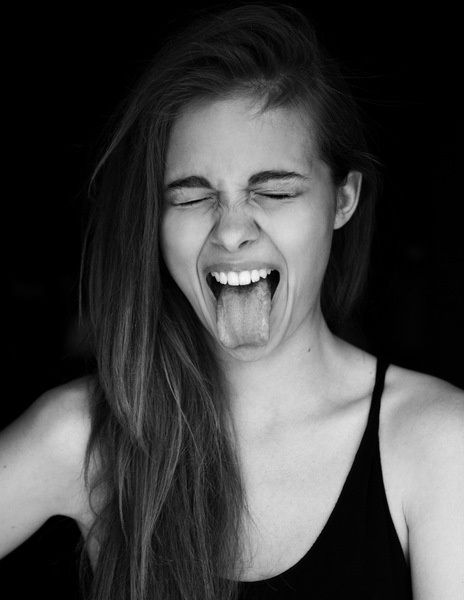
 I really like this photo because the painting dripping of the person can represent so many things. The expression the person has conveyed is very deep and distant, almost sad. as if that's what she really feels even of the only thing you can see is the happiness (the colorful paint). I picked this image because of the background which is just a simple green color that matches the paint. The image also includes cropping with the girl being close up.


Experimenting with Lighting:
there are many things you could do when it comes to using light in portraits; there are endless possibilities.
Lighting possibilities, such as side-lighting, can create mood and backlighting. Also, silhouetting your subject to hide their features can be powerful.

Introduce a Prop:
You can included a prop of some kind into your shots. It can create a better point of interest that will enhance your shot.
You have the risk of taking away the focus from your main subject. It can add a sense of story and place to the image that takes it in a new direction though. It also gives the person you're photographing an extra layer of depth that they would gave had without the prop.

Take Unfocused Shots:
As photographers. there is a 'sharp focus' rule drilled into our brains as an ultimate objective to achieve in our work. The sharp focus can feel a bit overrated; sometimes lack of focus can create shots with real emotion, mood and interest.

DIFFERENT TYPES OF PORTRAITS
Environmental Portrait

I really liked this photo because of how elegant the Queen's guard is and how simple the image is. I picked it because it includes the rule of third because the guard is standing off to one side of the shot.

I really liked this photo because of how the ocean around the girl was captured, with pristine and beautiful waters. I picked the photo because of how the water around the girl kind of frames her. The horizon of the water also follows the rule of thirds.
Photography Self Portrait
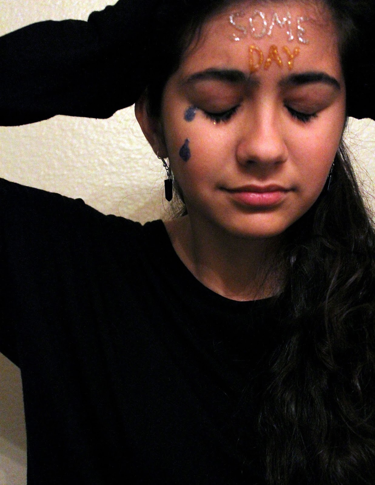
I really like this image because of the expression it conveys, it manages to capture this girl's inner thoughts, or just her inner self. I picked the photo because of the balance the girl has cross the image.

Casual Portrait

I really liked this photo because of the story it sort of tells. It shows us a little girl reading some fairytales which can inflict any type of emotion in the girl (it's just cute in general). I picked this photo because it fills the frame and includes a bit of a viewpoint angle.

I liked this photo because of the action that has been captured. A mother has picked up her little girl and the whole family is clearly having a fun time. I picked the picture because of the depth that has been presented here. There is a field behind this family that is blurred out and clearly looks like its far away, which is how the depth is created. There has also been some elements of balance because not only are the people evenly spread out across the image, both females of this family are sitting up and higher up on the image. In the meantime, the males are sitting farther down, almost laying down in the image, so that;s how some balance has been created horizontally.
I plan to take photos of family and of myself. Family members such as my sister and other relatives, such as my close cousins who I see often. I will probably take these photos outside where lighting will be better than indoors. I will probably want my subjects interact with nature which could include trees (I would probably go to a park). I will want to use my rules of photography, especially rule of thirds, balance, leading lines and cropping, to get a successful shot.
Subscribe to:
Comments (Atom)